Re-designing an e-commerce checkout
Uncommon Goods
Long story short: I led research efforts and contributed to designs for a major re-design of the checkout process; these changes led to an increase in mobile & desktop conversion rates. Also, I helped to establish internal practices for conducting user research, and helped internal stakeholders gain a better understanding of how user feedback contributes to the work done maintaining and improving the site.
This is the work I was a part of as a major re-design of the checkout process for a e-commerce retailer. This case study focuses on the research and design I contributed to the project after joining the team in 2017.
Process
I joined the project long after it started, so I quickly got up-to-speed on the goals for the re-design, and the internal processes that made our checkout process work. Our goals were to make sure the checkout process was as painless and quick as possible for customers, and update the design to match the current branding on the rest of the site.
There is a LOT that happened over the course of the year to reach these goals, but my overall process can be broken down into these sections:
- Understanding the Project
- Research, Research, Research
- Design Iteration and Internal Feedback
- Making Plans for the Future
Understanding the Project
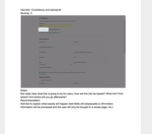
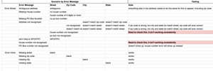
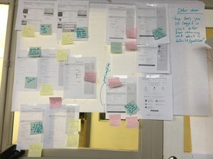
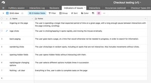
I started off with getting all of the foundational information I needed. I got a chance to go to our warehouse and spend time with the customer service team to learn more about how we helped customers get their items, and their typical painpoints. I also got as much info as I could about the current efforts, and any past research that had been done. I did some competitive research to get a sense of what established patterns already existed. I also did a usability audit of the experience, to keep track of issues, and to start logging what behaviors we should track during testing and after launch of our MVP.
Research, Research, Research
All of my research happened regularly throughout the project. In the beginning, I conducted remote testing (moderated and unmoderated) to get a better understanding of our users, and test early past designs. I also conducted testing for my own designs, and used findings to inform my iterations.
Our work was split into different sections of checkout, each with their own iterations and testing plan. I worked with my manager and the product manager to prioritize what we needed feedback on, and develop plans for testing different designs, depending on what could be prototyped, and what would need to wait until developers could work on it.
Before launch, I created a plan for final rounds of user testing to catch any lingering usability issues, and to help prioritize what issues would need to be addressed before launch. This testing was done with different groups of external customers, and any internal stakeholders that would regularly interact with customers.
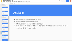
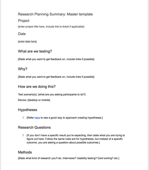
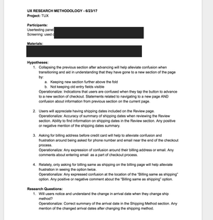
As the first UX researcher in the company, I wanted to establish good internal research practices, so I documented everything, and shared my findings frequently. I made sure to establish hypotheses for each test, keep track of the different methods I used for testing, and provide templates for other team members to use. I also included information from analytics in my research process, and referenced usage and conversion metrics when making design decisions. I gave a presentation on the basics of UX research to lay a foundation, and offered to have team members observe or watch user testing sessions.
I also communicated my findings to internal stakeholders often. Day to day, I kept my project manager (PM) involved and made sure to get feedback on scripts and prototypes. The PM and I agreed that it was crucial to keep other stakeholders involved and giving them opportunities to give feedback, so that they could better understand the changes being made to the site. I made sure there were opportunities for them to observe user testing, and to be participants when we needed internal feedback.
Design Iteration and Internal Feedback
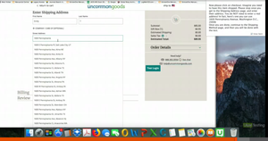
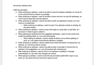
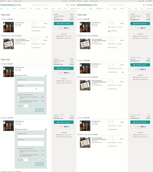
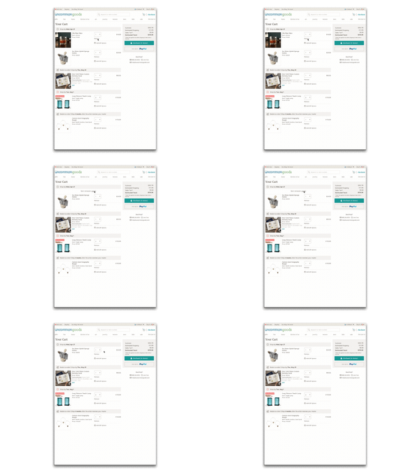
While I was researching, I also started working on re-designs for specific parts of the checkout experience, including selecting gifting options, the checkout experience for account users, users shipping items to multiple locations, the address validation process, and international shopping experience.
During each design iteration, I went through a mental checklist (in no particular order):
- Does this line up with past research findings?
- Does it follow established guidelines for usability?
- Will this impact our warehouse operations? Customer service?
- Does this fit with our project goals?
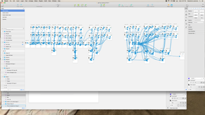
I learned our in-house style guide, and started working on different design iterations that fit within the parameters of what could be developed for the MVP launch. I created screen designs, UI changes to existing parts of the site, and user flows.
As mentioned before, I also conducted research as a part of iterating on my designs. While a lot of previous internal decisions were based on findings from analytics, I emphasized using qualitative testing as a way of understanding the why behind the behavior patterns found quantitatively. This would help prevent creating designs that addressed the wrong problem. I learned this the hard way after creating many, many iterations of one design over a few months before realizing this error.
I also collaborated with our creative team to work on animations and fun little additions to the experience. I worked on different design in stages, going through a cyclical process of user testing and getting internal feedback. Since I was new to the team, I leaned on my more-senior teammates to flag anything I missed regarding warehouse operations and logistics. I also found it key to get feedback very often from developers in order to gauge complexity of my designs, and prioritize what I tested and handed off to coordinate with their launch schedule. It was also very important that designs I made worked within the security requirements for our site.
Collaborating with my team was an important part of getting my designs to a place where they were worked visually and functionally.
Planning For the Future
Since this was an MVP launch, it was especially important to think ahead to what behaviors we would want to track to inform future changes. Also, we acknowledged that even fully-functional prototypes have limitations. You can only simulate the experience of making an online purchase so far, and I would often make a call on what testing would need to wait until after launch when we could observe users making real purchases. Whenever there were any questions about a design that couldn’t be answered before launch, I made sure to document it so that it could be re-visited.
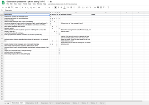
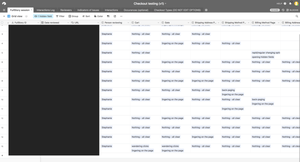
I took the approach of seeing our past research as a way of exploring hypotheses and research questions, and user testing as a way of gathering supporting evidence. There wouldn’t be “proof” any design “worked” until the full updated site was in users’ hands, and we had time to see if the new designs helped us reach our project goals. I worked with the project manager to determine what KPIs would be important to do so, as well as anything else we needed to track to prioritize future changes that were already planned for future releases. I set up tools to make it easy to code and analyze user observations using Google Forms and Airtable.
Results
By the time the MVP design was released, we had a plan for how we would evaluate its success, and gather the information needed to prioritize any future changes. We had established relationships with internal stakeholders to make sure that those future changes are made collaboratively.
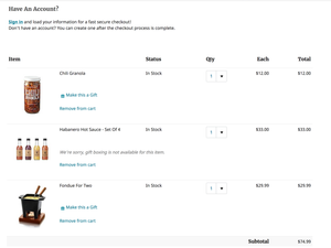
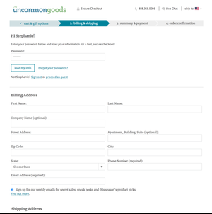
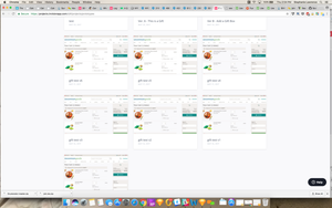
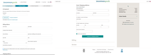
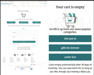
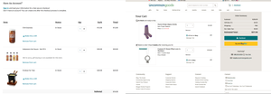
Overall, we were able to reach our goals, and have gotten positive feedback fro customers, and seen an increase in conversion rate. You can see two before and after examples of our designs below:
The main goal of improving the overall checkout experience was achieved, but also establishing a workflow for how designs received user and internal feedback. We reached our goals for our MVP, and established design and research process that we’ve followed and improved upon for later projects.
Lessons Learned
- Lead by example. A big part of this project was establishing research practices for my team that could be used on future projects. It wasn’t just a matter of getting things done, but communicating about how I did it, and sharing anything I found. It’s one thing to do research well, and another thing to try to be an example.
- Don’t make assumptions. It’s easy to make conclusions from analytics, but it’s even more important to think about AND confirm the why behind any patterns you see. Now I make sure to speak up when I see this happening on current projects, and provide alternate interpretations and research that could be done to figure out the motivations behind user actions. Making sure your designs address the heart of a problem is key. Even MVP baby steps need to move in the right direction.
- (Collaborative) Iteration is fundamental. It’s how design and research work together in practice. Researching forever wouldn’t have worked, and neither would tweaking Sketch files forever. Each step informed the next, and all of the customer and internal feedback I received helped me make decisions.
- Document, document, document. It was key that I kept notes and tracked open questions and “just for now” design decisions. Keeping a list of quantitative and qualitative KPIs to review post-launch has made it much easier to troubleshoot and prioritize issues, and inform the next set of design changes.
- What I
wouldhave done differently since then: More prototyping. Now that the MVP is launched, keeping track of user feedback through multiple channels (customer service, analytics, observations) is possible. Also, I will emphasize pairing any analytics with qualitative research when making data-informed decisions.
