Designing a new customer loyalty program
UncommonGoods
Long story short: For this project, I led the design efforts for my product team on the designs for a new free shipping program for our customers. This led to a successful launch that met business goals and increased revenue, and addressed a major pain point in our customers' experience.
Process
This process started as a business effort to address a common customer request, and increase sales. My role was not only to figure out how to add this program to the current shopping experience on the website, but to also help set specific business goals for what the program could be. This project was the unicorn situation of designers having "a seat at the table" from the beginning. That made my usual process a bit different, in that my initial efforts had four goals to design a program that, at minimum:
- Offered free shipping in a way that customers would understand
- Increase customer purchases
- Would appeal to customers
- Would be sustainable long-term
With this as my starting point, in order to do address these user and business goals, I needed to:
- better understand our customers and what would provide value to them as they shopped with us
- get design feedback to make sure what we offered spoke to their needs
- help the business decide how to prioritize offerings, and make (flexible) short & long term plans from the beginning
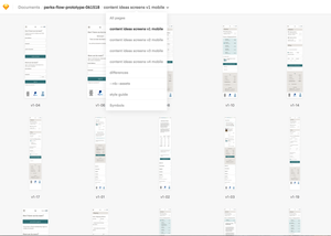
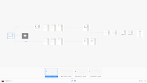
The process looked something like this:
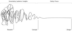
While many tasks overlapped, I've laid out a rough outline of the steps I took:
Step 1: Get everyone on the same page
- Include the product team and stakeholders across departments in initial idea generation
- Better understand user expectations
My goals for Step 1 were all focused on getting all stakeholders on the same page about what they wanted to program to be, and the impact it would have on the business. I especially wanted everyone to better understand what this program could mean to our customers, and focus on how it would impact their experience, and not just our own from an operational perspective.
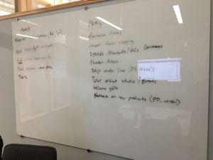
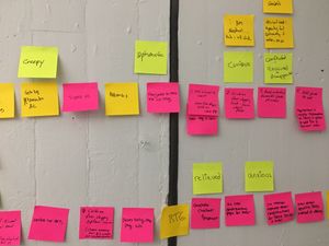
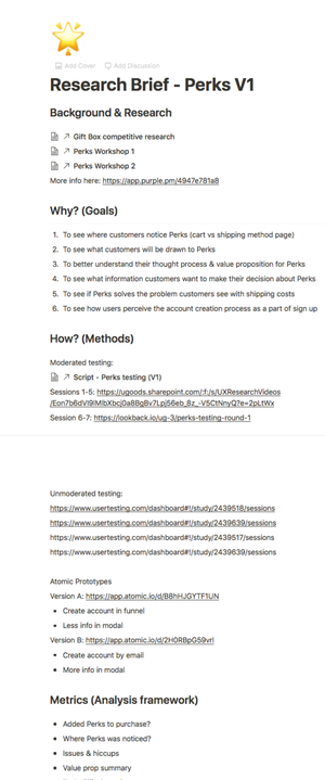
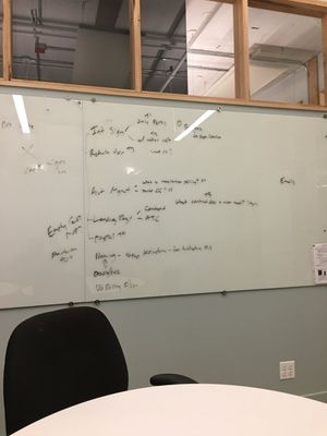
Initially, I organized workshops and spoke with stakeholders to create an aligned understanding of hat the program would be. Market research was already done to establish the basics of the program (free shipping for a yearly price), but I held workshops to 1) get ideas on what the customer loyalty program could be, and 2) find out what information we needed as a team from our current customers to gauge their reaction on these ideas, and 3) figure out how these ideas would affect our team operationally, including the warehouse and Customer Service. Since all of the main stakeholders participated, we were able to also weigh the pros and cons and prioritize as the sessions went on.
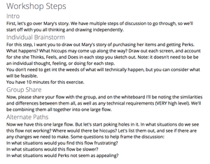
These workshops included some blue sky thinking of what the program could be, and an exercise where I had everyone think of what signing up for the loyalty program would look like from the customer's perspective, focusing on what they would be thinking, feeling , and doing during each step. (A weird twist on journey maps, empathy maps and CBT).
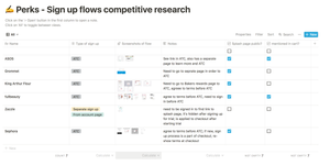
While I was doing the workshops above, I also took time to start looking at past feedback regarding shipping from customers, and do a competitive analysis to understand their expectations for a loyalty program that includes free shipping, since these types of programs were becoming increasingly popular at the time.
Step 2: Make sure that everything makes sense to customers
- Understand user expectations in context
- Understand who the program will appeal to
- Test initial design ideas
- Communicate everything to stakeholders and adjust the page we're all on
As I completed the tasks in Step 1, I also started to make rough drafts of initial user flows and screen designs in order to start getting feedback. I wanted to make sure I was balancing my focus on user needs while also understanding business needs. The basics of the program already looked sound based on the initialresearch I had seen, but I made sure to confirm that once I talked to users, and also gauge responses to the other new ideas that had been generated by our team.
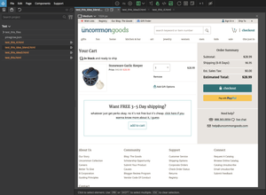
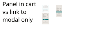
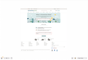
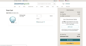
I also used this as an opportunity to start experimenting with designing with HTML/CSS. It was much easier to try out different ideas and layouts with code, and get a feel for the experience earlier in my design process. Especially since it was going to be a part of the existing checkout process, I was able to quickly test new UI ideas in code. Due to some technical issues, I still needed to create non-code prototypes, but I still had time savings taking this approach in my initial idea iteration. By the time I started testing, I felt not only more confident in my ideas, I was clearer in what I wanted to ask users about during user testing:
- Will this interrupt or confuse the checkout process?
- Where should it fall in the visual hierarchy on any given page in order to not be distracting?
- How will users understand what's being offered, and the money they can save?
- Where can it show up in the shopping experience in order to be the most appealing?
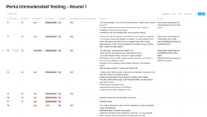
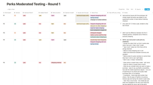
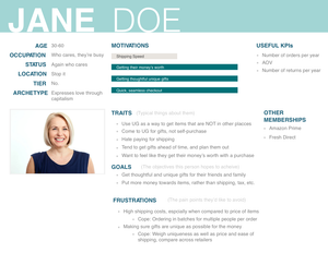
I made sure to communicate with developers to see what would technically be possible. I also made sure to track the research and share it with the team regularly. I learned my lesson from my previous experience doing research on the checkout experience, and came up with a workflow to easily track and share research findings with team members. Despite my dislike of personas, it ended up being an effective way of keeping stakeholders focused on what subgroup of our customers we were designing this program for.
Step 3: Iterate, Collaborate, Plan
- Create different design versions based on user and internal feedback
- User test even more
- Facilitate stakeholder decisions and plan what will be a part of the MVP release
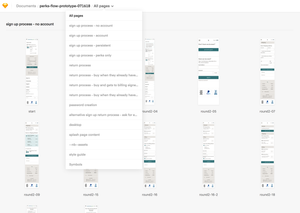
I continued iterating on the designs based on user feedback, as well as internal feedback. I broke down all of the possible user flows into two main groups: the flow for signing up for the program, and the flow for using free shipping during a purchase.
I worked through each scenario for these two groups based on other factors, while the development team started their work. I started thinking of ways to make straightforward user flows for each scenario within each group: What if someone forgot their account password as they tried to use their free shipping? Or decided to sign up when they were a step away from finishing a purchase?
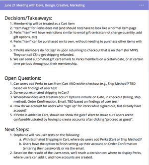
I also continued to create prototypes and conduct user research to help facilitate business decisions and resolve debates between stakeholders as we worked to decide on an MVP plan for the initial release. I also made sure to incorporate user feedback as I worked on smaller UI decisions.
Step 4: Get ready for launch
- Create MVP user flows and designs
- User test even MORE
- Plan content for visual design and marketing
- Design QA
- Plan what will be monitored after launch
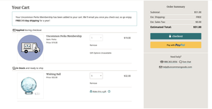
This step happened concurrently with Step 3, once we got to a solid point of agreement on what benefits would be offered in the program. I started working on "final" designs for the MVP launch, piece by piece.
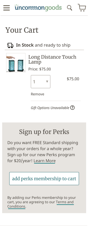
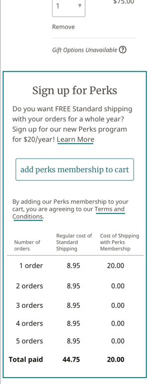
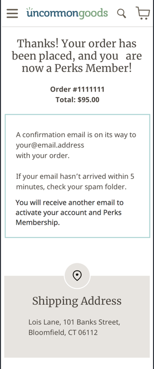
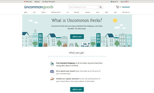
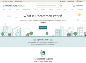
This was also the point that the product manager and I started working more closely with our visual designer and copywriter to work on the copy and visual design for everything that would be a part of the product launch (marketing emails, splash page, catalogue section, etc.). For the website, I laid out what information needed to be presented, and they were able to take it to another level:
I worked very closely with the developers to make sure I covered all of the technical cases they could think of, and make sure that the everything could technically work throughout the checkout experience. Once I "handed off" designs, the communication continued throughout the design QA process, and as they found new cases for me to design as they worked.
I also worked with the product manager to make sure there was stakeholder alignment on the business implications of each user flow, and decide together if any operational or technical workarounds would need to be in place in the short-term. We made sure to get feedback from customer service on how this would impacgt their workflow. The user feedback on designs continued as well, to make sure we got feedback on all of the main user flows and edge cases, and make sure we found as many hiccups in the experience as possible.
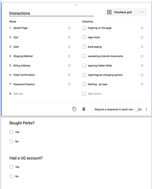
Like I had done for previous major releases, I made a post-launch plan and started preparing the tools needed to review recorded sessions in order to 1) track the success or problems with decisions we made, and 2) track issues that would be addressed in later sprints. I set up a Google form to do this, so that anyone on the team could review sessions and contribute.
Results
The launch was successful, with customers signing up and without and large issues. The project ended up being a culmination of the work done on past projects; as a product team, we had a system for working collaboratively, and a lot of the groundwork I had done to normalize doing user research and internal workshops within our product development process paid off. Not only was the launch successful, there was also a solid foundation laid to continue testing and trying ideas for what the program could become.
Lessons Learned
- Work with copywriters early and often. It was great to have the experience of getting feedback on my copy from someone that knew writing so well, and understood the messaging used across all of the company's communication channels. It was key to making sure this launch worked well and that customers understood what the loyalty program would offer them.
- Plant seeds early, and they'll grow when you need them. It was nice to hear others on my team talking about hypotheses and wait to hear about testing results. Even when there was time pressure, there was a precedent to have a discussion to prioritize, rather than just dismiss, any research or design work. There was a lot fo work to do, and this made it much easier to move quickly and experiment often throughout the iteration process.
- Having a "seat at the table" means balancing user and business needs. I couldn't afford to ignore any business questions or concerns, and the discussions I facilitated ultimately helped to align business and user needs over time. It's tricky to balance designing an offering that involves free features without taking this approach. I saw my role as centering users' perspectives within our internal discussions. While talking about business needs with stakeholders, I could highlight ideas that would be seen as confusing, help with prioritizing what offerings would address user needs the best, and speak on how having free shipping would impact their entire shopping experience.
